Dashboard Controls
Time Range
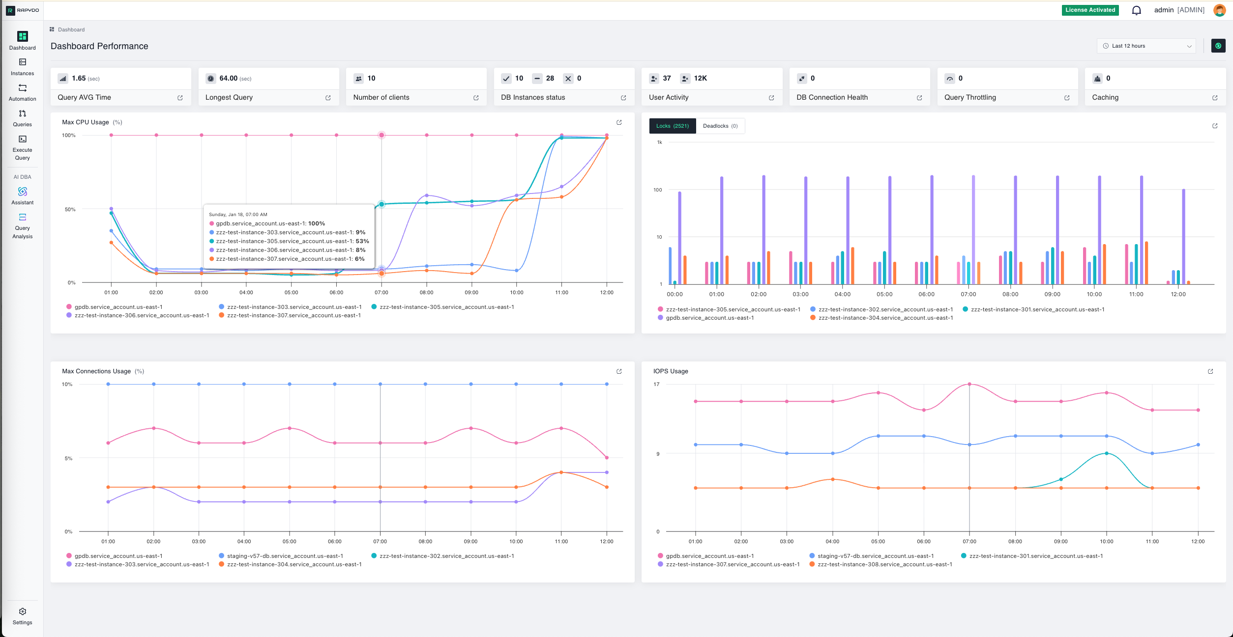
This widget displays the time range for the data represented in the graphs and metrics. You can adjust the view to show performance and activity from the last 3, 6, 12, 24, or 48 hours based on your monitoring needs. Use this to:- Focus on recent incidents or performance spikes
- Compare current activity to historical patterns
- Zoom in on specific time windows for detailed analysis
Instance & Health Metrics
DB Instances Status
This widget displays the total number of database instances across three states:- Configured: Instances discovered and actively monitored by Rapydo
- Not Configured: Instances detected but not yet configured for monitoring
- Not Available: Instances that cannot be reached or are unavailable
DB Connection Health
This widget shows the count of unclosed (unhealthy) connections across all monitored instances. What to watch for: A non-zero unclosed connection count could indicate network issues, resource constraints, authentication problems, or connection pool exhaustion. Investigate immediately to prevent system downtime or performance degradation.User & Client Activity
User Activity
Displays the current number of active versus inactive users across your database infrastructure:- Active Users: Users currently executing queries or maintaining active sessions
- Inactive Users: Users connected but not performing any significant activity
Number of Clients
This metric shows the total number of active database clients. A client refers to an application or user connection to the database. Why track this:- Understand connection patterns throughout the day
- Plan for peak usage periods
- Identify unexpected spikes in client connections
Query Performance Metrics
Query AVG Time
This widget shows the average query execution time across all database instances over the selected time range. It provides a quick snapshot of overall query performance. What to look for:- Sudden increases in average time may indicate performance degradation
- Compare to historical baselines to identify trends
- Use this as a starting point for query optimization efforts
Longest Query
Displays the duration of the longest-running query currently executing or completed during the selected time range. Why this matters: This metric helps identify potential bottlenecks and inefficiencies:- Long-running queries can block other operations
- May indicate missing indexes or inefficient query structure
- Could signal the need for query optimization or resource scaling
- Summary statistics — aggregated stats for the longest queries
- Detailed information — full per-query details including query text, with options to analyze using Query Analysis
Caching
Shows the current caching activity and efficiency across your database instances. What to watch for:- Low cache hit rates may indicate opportunities to optimize query patterns
- Sudden drops in caching efficiency can indicate configuration or workload changes
Database Locking & Contention
Locks & Deadlocks
This bar chart shows both locks and deadlocks over time across your database instances. Use the Locks / Deadlocks toggle on the widget to switch between the two views. Clicking a bar navigates to the Queries page filtered to that database instance and a 1-hour window starting at the clicked timestamp. Clicking the widget title opens a detail view with two tabs:- Number of locks
- Number of deadlocks
- Large spikes in lock or deadlock counts
- Sustained high lock levels
- Correlation between locks and slow queries
DEADLOCKS
This bar chart shows the number of deadlocks encountered across your database instances over time. What are deadlocks? Deadlocks occur when two or more queries block each other, preventing further execution. For example:- Transaction A locks Table 1, waiting for Table 2
- Transaction B locks Table 2, waiting for Table 1
- Neither can proceed, creating a deadlock
- Deadlocks can cause transaction failures
- May indicate poor transaction design or locking strategies
- Repeated deadlocks suggest the need for query refactoring
Resource Utilization Metrics
Max CPU Usage
This line chart shows CPU usage (%) across different database instances over time. Each colored line represents a specific instance. What to monitor:- Instances approaching 100% CPU utilization
- Sustained high CPU usage indicating resource-intensive workloads
- Sudden spikes that correlate with slow query performance
- Optimizing resource-intensive queries
- Scaling to a larger instance size
- Distributing load across additional instances
Max Connections Usage
This line chart displays the percentage (%) of maximum database connections being used across different instances over time. Why this matters: Each database instance has a connection limit. When you approach this limit:- New connection attempts will fail
- Applications may experience connection errors
- Database performance can degrade
- Monitor instances approaching 80-90% connection utilization
- Implement connection pooling in applications
- Consider scaling instance size if sustained high connection usage occurs
IOPS Usage
This line chart shows Input/Output Operations Per Second (IOPS) for each database instance. IOPS measures the performance of your storage system. Values are shown as raw numbers (no percentage). Understanding IOPS:- High IOPS: Indicates heavy read/write activity
- Low IOPS: Suggests light database activity or caching effectiveness
- Spikes: Often correlate with batch jobs, reports, or data loads
- If sustained high IOPS occur, consider:
- Scaling to faster storage (e.g., Provisioned IOPS on AWS)
- Optimizing queries to reduce disk reads
- Implementing better indexing strategies
- Adding read replicas to distribute load
Drilling Down for Details
Every widget on the dashboard is clickable, providing deeper insights into specific metrics. When you click on a widget, you’ll see detailed information, historical data, and actionable options for that metric.Example: Clicking the Longest Query Widget
When you click on the Longest Query widget, you open a detailed view showing all currently running queries sorted by execution time.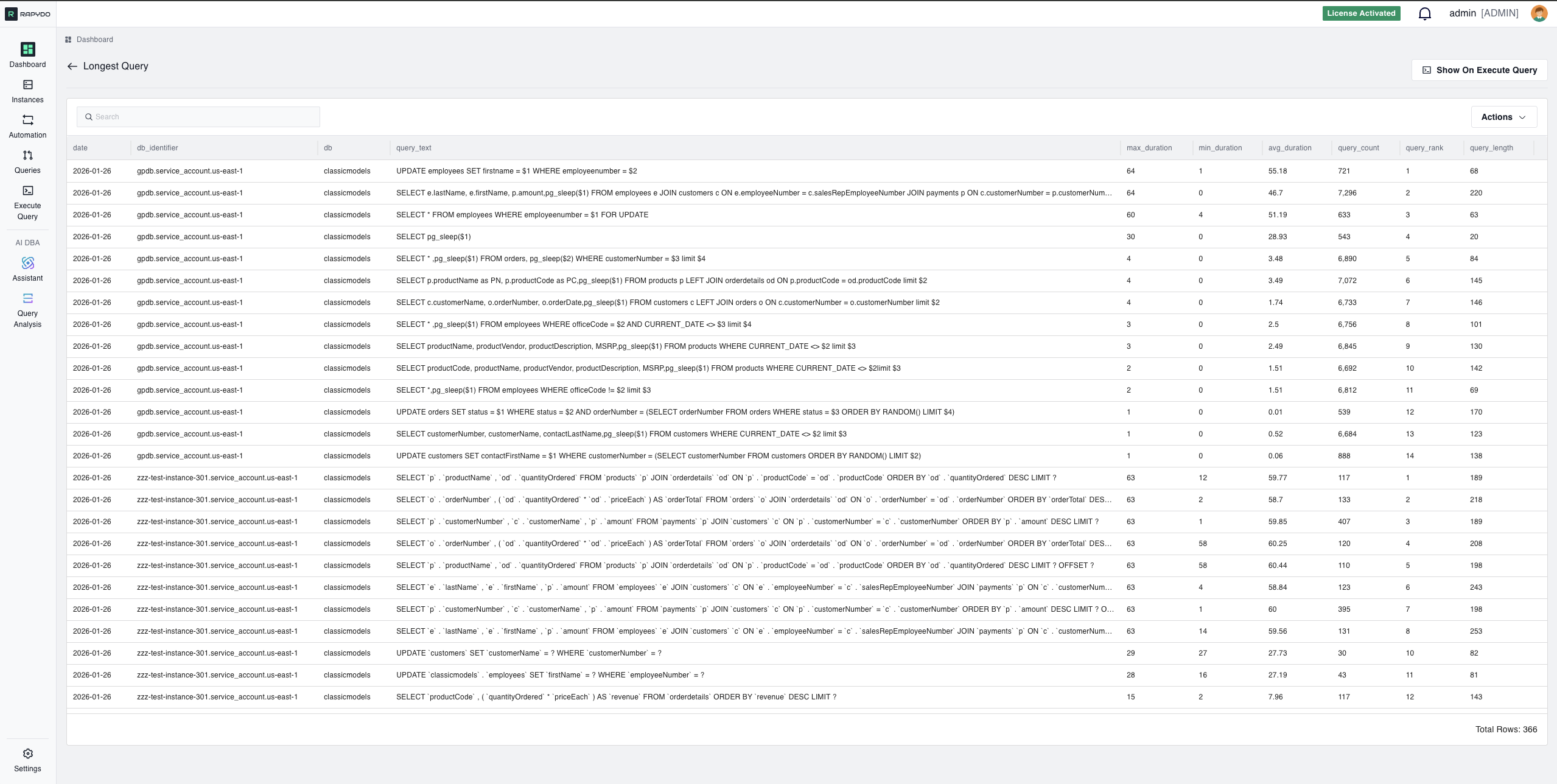
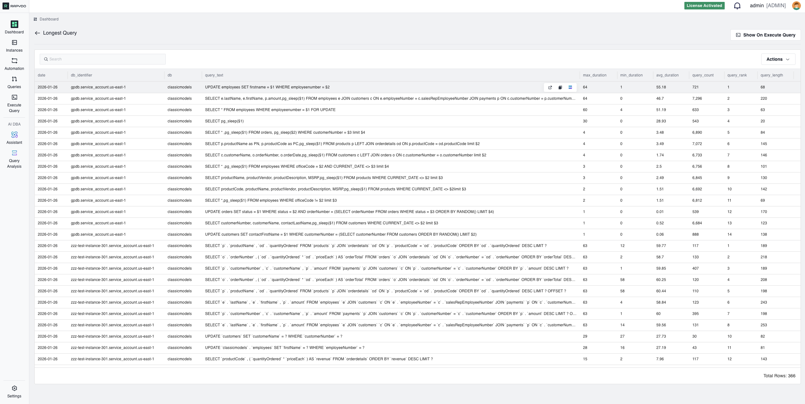
- View Query Details: See the full SQL query text, execution time, and database instance
- Analyze Performance: Understand which queries are consuming the most resources
- Identify Bottlenecks: Spot queries that may be causing performance issues
- Take Action:
- Kill long-running queries that are blocking resources
- Analyze the query using Rapydo’s AI-powered Query Analysis
- Copy the query for optimization in the Execute Query tool
- View the query execution plan and get index recommendations
Interactive Widget Navigation
Each widget provides a gateway to more detailed information:
Pro Tip: Click on any metric that looks unusual or concerning to investigate further and take immediate action.
Quick Reference: When to Investigate
Next Steps
- Set Up Alert Rules - Get notified when metrics exceed thresholds
- Configure Scout Rules - Automatically respond to long-running queries
- Analyze Query Performance - Deep dive into slow queries
- Monitor Locks & Waits - Investigate blocking queries